Chapter Eight Frameworks and Etiquette
The question, O me! so sad, recurring—What good amid these, O me, O life?
Answer.
That you are here—that life exists, and identity;
That the powerful play goes on, and you will contribute a verse. Walt Whitman
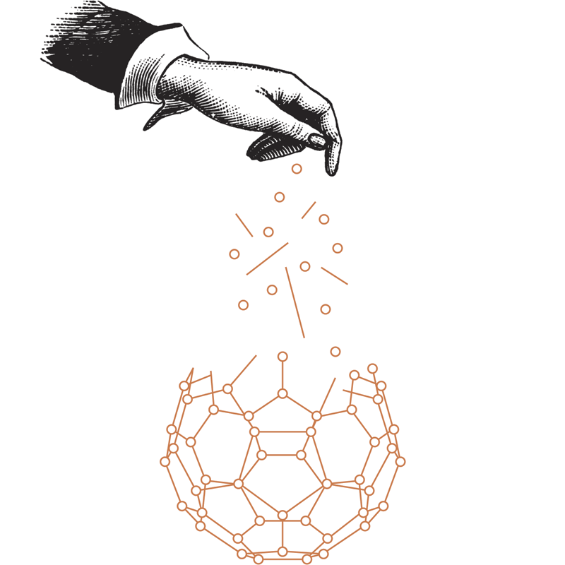
There are two successful outcomes when a design focuses on its audience: resonance and engagement. Stories speak to the first and frameworks to the latter. Frameworks are the structures that allow for contributions to be made to the products of design, and increasingly, it has become the work of the designer to create these frameworks. One of the more central questions that design must now address is how one produces an enticing environment for conversation, community, and creativity.
A framework is the bridge that connects the designer to the audience and goes both ways. It also nicely resolves a thought that crosses my mind frequently while working: “What if the audience is smarter than I am?” If the audience knows more about what they need than the designer does, it seems silly to not have a way to gather their thoughts, opinions, and proposed solutions. Frameworks open up a valve of communication and contribution; if effective, they reap the rewards of an intelligent and experienced audience. A good framework is an enticing means of contribution and an invaluable feedback mechanism. It gives designer and audience shared ownership of the products of design, a true synthesis of requirements.
Largely, the practices that make for good improvisation produce good frameworks, because both are created to help initiate creative work and encourage contributions from others. I’m reminded of the Japanese renga mentioned earlier, where the poets would contribute lines and daisy-chain them together to create a whole greater than the sum of its parts. The framework wasn’t the poem, but the structure and methods employed to help produce it. There were rules and limitations to the game, with social etiquette layered on top, and these elements interacted to create the materials for the poets’ interaction. I think all of these patterns apply to contemporary frameworks as well: there is the action that needs to be done, the tension of creating a worthwhile larger work, and the social etiquette necessary to pull it all off. The goal is the same now as it was in the time of the renga – to build something of quality, to have others contribute something of themselves in the process, to have those individuals interact with one another as a community of contributors. All frameworks are implicitly social in that they are an environment where conversation, sharing, and building occur. They’re collaborative.
Earlier I discussed improvisation as it applies to a personal creative process, but more frequently, improv is a social act. The results of the improvisation are built up through dialogue between many individuals, whether it is a group of jazz musicians sharing a stage and trading fours, or a troupe of improv comedians feeding one another material to get laughs. And so all of the tenets that influence improvisation on an individual level also need to be applied collectively for frameworks. Contributions must be accepted, and then appended by someone else, which brings us back to “Yes, and….” Momentum also matters here, so the materials need to trade hands frequently, with tight feedback loops to quickly incorporate each contribution to the whole. There’s a special satisfaction in contributing to something, and it becomes even more rewarding when everyone can see how their part has influenced other aspects of the creation.
Liz Danzico likes to frame up her experiences of contribution by telling a story about a saltbox that hung beside her mother’s stove while she was growing up. Occasionally, her mother would ask her to add a bit of salt to the pot while the meal was on the stove simmering. Salting was a way for her to participate in making dinner; the salt was an agent of change that she could use to contribute to the meal, and the saltbox was the structure that allowed her to contribute. The saltbox, if you will, was the framework.
I think the process of salting is an apt analogy for a creative offering, because the soup in the pot isn’t Liz’s creation, but she’s the one who imbues it with flavor by adding salt. Salting happens one pinch at a time – it is a gradual process – with success determined by tasting afterwards. We judge what we’ve done by testing the change we’ve created, and that’s how a good framework should feel for the audience when they contribute. The path is self-correcting, because they can observe the influence of their actions and make changes if needed. Maybe the soup needs more salt. The feedback loop is purposefully tight. That’s why you can trust a child to help with dinner without ruining the meal: it’s a small effort with low risk, but big rewards.
Salt releases the food’s natural flavors when applied judiciously, and this speaks to the benefits of a successful framework: it’s not the main dish, but a meaningful addition to what the audience already wants to achieve. It enhances what they already intend to do and increases the quality of what they would have been able to achieve on their own. But frameworks have a tendency to disappear when they are intuitive and carefully planned, because our attention is on the wonderful fruits of the process. We typically only notice frameworks, like salt, when something is out of balance. Consider salt in a cookie: we only taste it when there’s too much or not enough, because when the balance is just right, we hardly realize it’s there.
Frameworks have always existed, from game design to the office suggestion box, but their importance has been amplified by the presence of the internet and the opportunities that the web affords. Designers must manage a new kind of conversation around their work, because connectivity has created new opportunities for audiences to contribute. We are no longer only designing logos, brochures, and posters, but now also experiences and interactions that provide the path for audience engagement. If resonance and engagement are our goals, then improvisation is the blueprint for creating these interactions. Improvisation’s ability to manage the contributions of others and lead them to a desirable outcome makes it a prime lens to view and understand these new requirements.
The proximity of the audience to the work should be considered an overlap of interest. The designer and audience are now wed in co-authorship, with each of their contributions part of the dialogue that establishes the characteristics of the project and the direction it will take. Kind of Blue, for example, is credited as an album by Miles Davis, but, in truth, it is an album made collaboratively with all the other musicians in the studio. The music did indeed spring from the limitations Davis wrote on those slips of paper, but once providing the framework, he wisely stepped back and relinquished complete control and authorship.
Designers should do the same with the frameworks they produce. They should begin by setting good restrictions that act as suggestions, but then step out of the way to see where the audience takes those purposeful limitations. Stepping out of the way requires a new way of thinking, because the designer can no longer command the whole ecosystem of the work if others are contributing. The control that designers so often desire is undermined through an unpredictable collaboration with the audience.
Again, the solution is for the designer to sway responsively to the shifting context of the work with the contributions of the audience. The key is to understand when to surrender control and let the audience drive, and when to exert authority to focus everyone’s effort to ensure a more meaningful outcome. A gentle touch, more often than not, is all that’s needed to guide things in the right direction. One could say that Davis’ genius with Kind of Blue was introducing that gentle touch to jazz, favoring a few simple scales over the elaborate scaffolding of Bebop.
A good set of well-chosen rules makes the contributor feel like they are already halfway done: all that is left to do is to sort out the details and execute their idea. A good example would be the easy hand-holding of a MadLib – name a few words, drop them in, and then read what funny nonsense results. The framework limits what words go where; place an adjective here, a verb there, then a name, and presto: you get a funny story. Bad choices in frameworks, however, have a tendency to feel too limiting; they are frustrating and unclear to the audience and squelch any inkling of interest in participating. Imagine if the MadLib asked for a present participle that modifies a noun as an adjective. The value proposition for contributing becomes an unappealing one.
The contributions of the audience fortify the work, create identification and ownership in them, and solidify the community around the design. Frameworks are collaborative and social in nature, so etiquette also becomes a concern for the designer. I have a friend who collects etiquette books, and it’s only recently that I think I’ve come to understand why she does this. The books highlight the important points of our engagements with one another. Manners underscore what we feel is proper. Etiquette is composed of the rules of engagement, and how we interact when we’re together. Designers need to think about setting these rules, because they exist to grease and ease social interactions.
The start of the internet produced a lot of discussion about “netiquette” to establish the social norms that would dictate our interactions in this new and unfamiliar digital space. Those conversations have largely vanished in the past two decades, which is a shame, because while the web has become increasingly social, we haven’t developed many new social protocols to handle the glut of demands created by socializing online. Our initial attempts at netiquette translated our existing manners into the digital space. We were correct, to a large extent, to bring along the behaviors that come from kindness and politeness, but collective socializing online is not a mirror image of doing so in physical space. Most relationships are asynchronous and anonymous. Believing that a simple one-to-one translation of the norms we have in physical space should work in digital space underestimates the influence that our new connectivity has over the way we socialize. The tools we have shape how we use them, and the social web, frameworks, and their design decisions establish how the audience contributes and how they relate to one another as individuals.
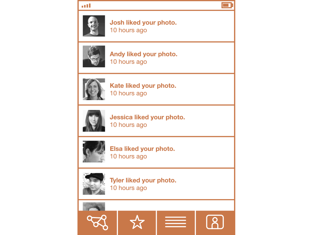
The story about Ogilvy and the blind beggar speaks to the consequences of when the personhood of an individual is amplified or minimized. The human presence changes behavior. Ogilvy created a space for empathy by telling a story, and I think that the decisions of a designer can influence whether or not users empathize with one another when huddled around a framework. Empathy is crucial in these cases, because frameworks are the means to build up things collaboratively. Let me give an example. A few weeks ago, I was using an application on my phone that is essentially a framework for sharing photos with friends. These friends can comment on the photos and favorite them. There is a screen in the application that lets you look at the updates describing who has liked a photo that you have taken, or if new people have shown up and subscribed to your stream of photos. The interface looks, roughly, something like this:

It’s a nice design, and it provides a concise digest of activity around the photos that I’ve taken, but I think it’s a complete failure in reinforcing the emotions that make the behaviors it presents meaningful. I look at this screen often, but the one thing I should feel – thankfulness for the kindness and recognition of others – never materializes.
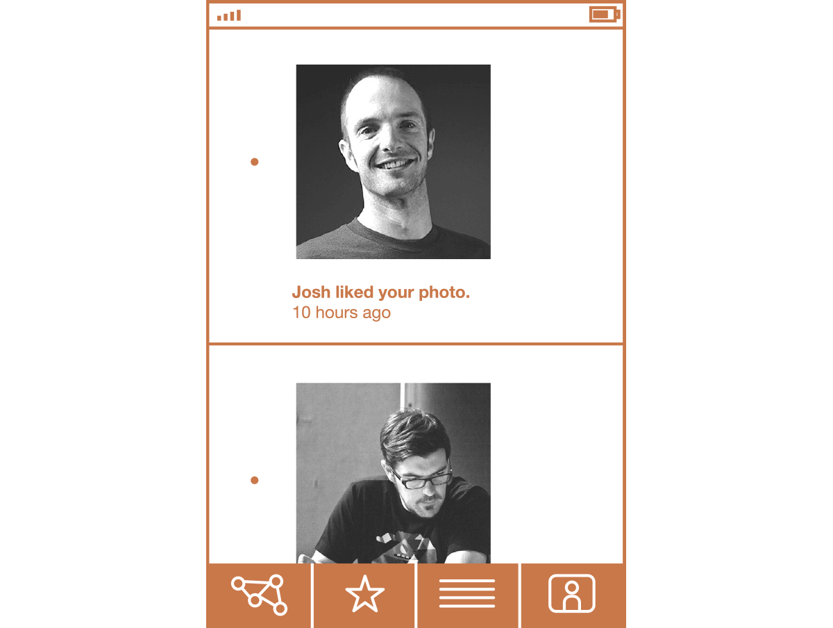
Except for the one time it did: I opened the application one day to discover a rendering bug had enlarged the avatars on this screen. That one simple change made me feel a part of this photography framework and the community it sustains. Seeing the faces of the ones who liked my photos made me part of a web of mutual appreciation. The people snapped back into focus as individuals.

I began to think about the screen’s original design: it had information density, but it wasn’t a suitable representation of personhood. The design was optimized for consumption of information rather than thankfulness for the interactions and relationships it depicts. Appreciation is a significant aspect of positive experiences; if the design choices have been optimized for consumption instead, it turns an opportunity for nourishing collective resonance into a gesture of empty snacking. All of which begs the question: was the rendering mistake actually a mistake if it fixed the most fundamental problem of the original design? The bug was eventually fixed and the screen returned to the original layout, but I want my big faces back.
