Chapter Nine Delight and Accommodation
Who ever said that pleasure wasn’t functional? Charles Eames
Design doesn’t need to be delightful for it to work, but that’s like saying food doesn’t need to be tasty to keep us alive. The pedigree of great design isn’t solely based on aesthetics or utility, but also the sensation it creates when it is seen or used. It’s a bit like food: plating a dish adds beauty to the experience, but the testament to the quality of the cooking is in its taste. It’s the same for design, in that the source of a delightful experience comes from the design’s use.
There is a tendency to think that to delight someone with design is to make them happy. Indeed, the work may do that, but more appropriately, the objective is to produce a memorable experience because of its superior fit. The times that design delights us are memorable because we sense the empathy of the work’s creator. We feel understood, almost as if by using the work, we are stepping into a space designed precisely for us.
Outside of design, the most delightful memories are some of my strongest. They’re of the idyllic times where I felt like I fit: the world seemed to be orchestrating itself just for me. I was exactly where I was supposed to be at the right time. Of course, these situations weren’t constructed for me, but the experiences felt like they were tailored. They were specific and personal, empathetic and warm. The experiences shine more in their remembrance, turning into a kind of self-perpetuating myth whose importance grows with each retelling. Why shouldn’t delightfully designed experiences be like these memories? Now, it’s far outside of the capabilities of anyone to maneuver the parts of the universe to recreate the idyllic experiences to which I refer, but with each project, designers are given a chance to align the specifics in a fitting way to create that same sort of feeling. Empathy creates an opportunity for skillful accommodation.
Again, design gets wrapped up with how the work feels while being used. All design is experience design – whether it is visiting a website, reading a book, referencing a brochure, interacting with a brand, or interpreting a map. All of these interactions and objects of attention produce experiences of use, and those experiences can be made better and more memorable by skillfully catering to the audience in an accommodating way.
Delight, unfortunately, can be painted as a quick fix or a gimmick that offers a snazzy way to spit-shine a poor idea with novelty. The intentions of creating accommodating work go deeper than just a surface treatment, and are meant to build and maintain meaningful, nourishing, and codependent relationships between the designer and audience. The decisions that make a design delightful are an expression of compassion for the audience and care for the work being done. They should attempt to build up long-term benefits rather than temporary gains. The gestures that make a design delightful can be small, but their implications are meaningful: they are part of an attempt to engage an audience in a consequential, human way, and to maximize the opportunity of the situation for everyone.
The correct choices feel much like an embrace. A space of accommodation has been skillfully created by the designer for the audience to occupy, and the audience need only to step into the space for it to be completed. It’s an architected space crafted through empathy based on the designer anticipating the disposition and needs of the audience to achieve a good fit. For instance, there is a certain small satisfaction when our spell check learns to automatically correct our frequent typos, or when the handbasket appears in the grocery store right as we pick up the extra item that makes it too difficult to carry everything with our bare hands. The fit is the result of a successful decision made in response to the desires and natural behaviors of the audience.
There’s room for a delightful approach in most design, even in the most conventional of exchanges. In Griffin, Georgia, for instance, there’s a road sign hung over the state highway a hundred yards in front of a bridge. The sign warns oncoming traffic of the low overpass ahead by saying:
If you hit this sign,
you will hit that bridge.
There are many different ways that the sign could have been made, but this particular one is effective because all three parts of the design – the message, tone, and format – are treated in a delightful way. The text gains clarity, immediacy, warmth, and humor through the tone of the writing, and the format is manipulated in a pleasing way because of the position of the sign. Placing the sign over the road rather than next to it gives the warning a more direct relationship with the hazard it warns against. It’s not just a written warning, but also a feedback mechanism for the real threat ahead. The sign provides a great example of how to approach a design problem to create delight, and highlights what makes a design delightful: it empathizes with the audience and their circumstances, surprises in its delivery, and achieves a clarity in what it is trying to say or accomplish. A delightful experience is the overlap of these three things.
Surprise is a crucial component, because it is hard to delight someone if they expect what they are being given. Delight fades when there is entitlement or predictability, and that’s why so many of the delightful experiences in commerce involve a customer being under-promised then over-delivered. They get into an engagement expecting a certain amount, and are delighted when they get more than they bargained for.
The simplest form of delightful surprise is serendipity, when we are presented with an unexpected relevancy. Serendipity in design provides a new viewpoint that makes us look at what we are doing in new ways. It is the opposite of purposefully designing for delight, but like a scientist observing natural occurrences in the lab, understanding the natural patterns of things allows us to reconstruct them in our work. One of my favorite serendipitous occurrences is an error message that came up one day while writing:
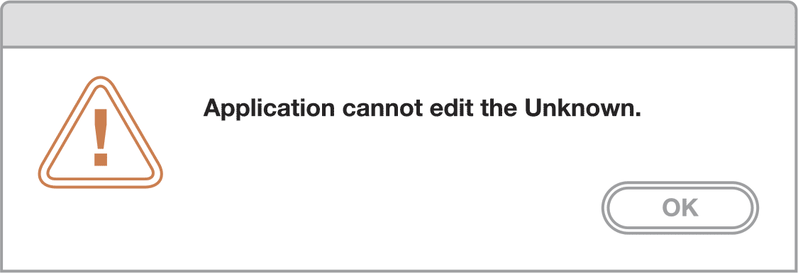
Isn’t it pleasing to think that software has pathos, and that writing is just as difficult for it as it is for us? I admit, most error messages create a large amount of grief because they signify lost work, but when this particular one popped up, I had to laugh. “Application cannot edit the Unknown” (capitalized, proper noun), and all I could do is to accept it and say OK. The computer had been personified for a moment, and in its existential crisis, I felt like it understood my writer’s block. It was comforting to have company when lost in my words. This happy circumstance means that one of the best opportunities to delight the audience is when something goes wrong.
We can also be surprised by delight when the mundane is rethought and elevated. At the Ace Hotel in New York, a required exit sign over a door was an eyesore, and a stark contrast from the considered, detailed wall where it was mounted. Rather than accept the wart as it was, the sign was embraced as a chance to create an experience for the hotel’s guests by integrating the exit sign into the space. Now, surrounding the sign are other letters painted on the wall in a similar condensed style:

Every requirement is an opportunity for delight, even the ugly ones. Sometimes the creative treatment of these warts are the most enjoyable parts of a design.
Delightful design also adds clarity by finding the balance between adding details for resonance and taking them away for simplicity. When the two are balanced correctly, we’re left with a design that shows up when it offers something of value, and then gets out of the way when it is not needed. Sometimes, more must be added to give clarity to the work, such as how a map may have added guidance along with street names to make it easier to navigate; but usually value and delight are created by taking things away and reducing friction.
It is a chore in most hotels and airports, for instance, to get connected to the public WiFi. The process is wrought with roadblocks and complications: login screens, user agreements, registration pages. The web page used to access the WiFi at the Ace Hotel, however, has a simpler approach to that interaction:
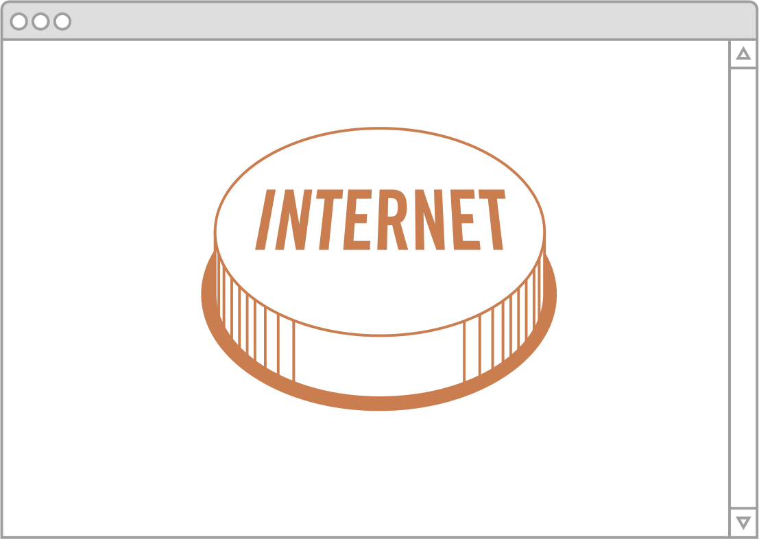
The internet button surprises and delights, because it understands what the user wants to do, and eliminates everything else that doesn’t pertain to that goal. Clarity emerges, and delight shows up with it, because we feel like our intentions are plainly understood.
The most important element of delightful design is empathy. Clarity and surprise are only achievable through empathy with the audience. An intimate understanding of the audience means that our designs can be warmer in their communication and more appropriate. We can be friendly and good-natured with the ones who imbue our work with its value. Projects that seem cold or excessively composed are more indicative of a lack of understanding than a mark of professionalism. One can speak naturally and personally when they know someone well, and a friendly, affectionate, and hospitable tone is essential to cater to audiences, encourage dialogue with platforms, and produce the utility and resonance that great design seeks to achieve.
Delightful design attempts to make the work more pleasurable for everyone involved in it, and in doing so, makes the designer and the audience more aware of one another. This seems to be a foolish thing to say, but without the empathy that delightfulness requires, it’s quite easy for the designer to be short-sighted and see the design work as a set of logistical problems to overcome or creative challenges to master, rather than an opportunity to produce something that enhances someone else’s life. The warmth and exuberance of communication and the accommodation to the audience necessitated by delightful design also makes it easier for the audience to spot the presence of the designer in the work. The work becomes more humanized in its tone and effect, so it becomes easy to see that there are people behind it.
